How I Illustrated the Hunger Games Series — Symbolism, Process & Creative Decisions
As a British Muslim, South Asian illustrator, storytelling has always been a way for me to process the world — visually, emotionally, symbolically. When I decided to illustrate The Hunger Games series for my portfolio, I wanted each cover to feel deeply connected to the themes of rebellion, survival, and human resilience that define Suzanne Collins’ world.
This blog post breaks down my full creative process — from colour symbolism to hand-drawn motifs — and shares the hidden details behind each illustration.
My Visual Approach to the Hunger Games Universe
Keywords: Hunger Games book cover illustration, YA book cover design, symbolic illustration, hand-drawn book covers
I approached the series with one main question:
How can illustration capture the emotional weight and political commentary of Panem?
To answer that, I leaned into:
Hand-drawn elements to create intimacy and human vulnerability
Symbolic borders to represent confinement, control, and rebellion
High-contrast colours to mirror tension, destruction, and hope
Layered lettering to embed narrative clues into the titles themselves
Black backgrounds became the grounding motif — representing District 12, coal dust, and the oppressive darkness of the Capitol’s regime.
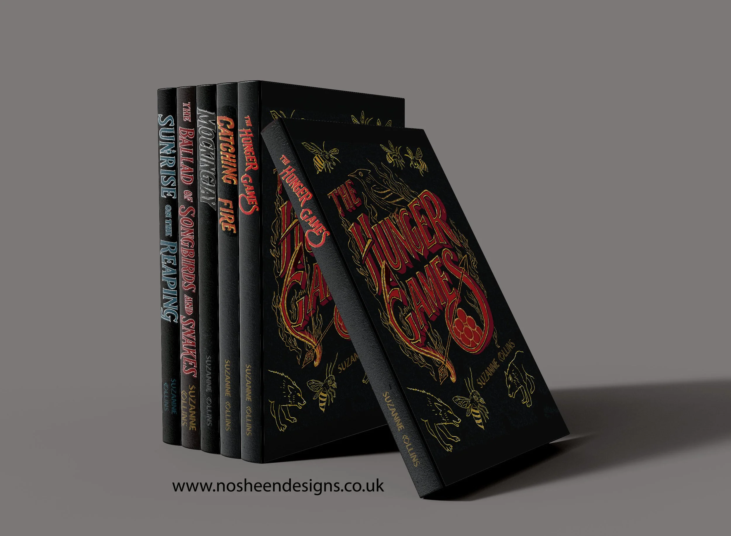
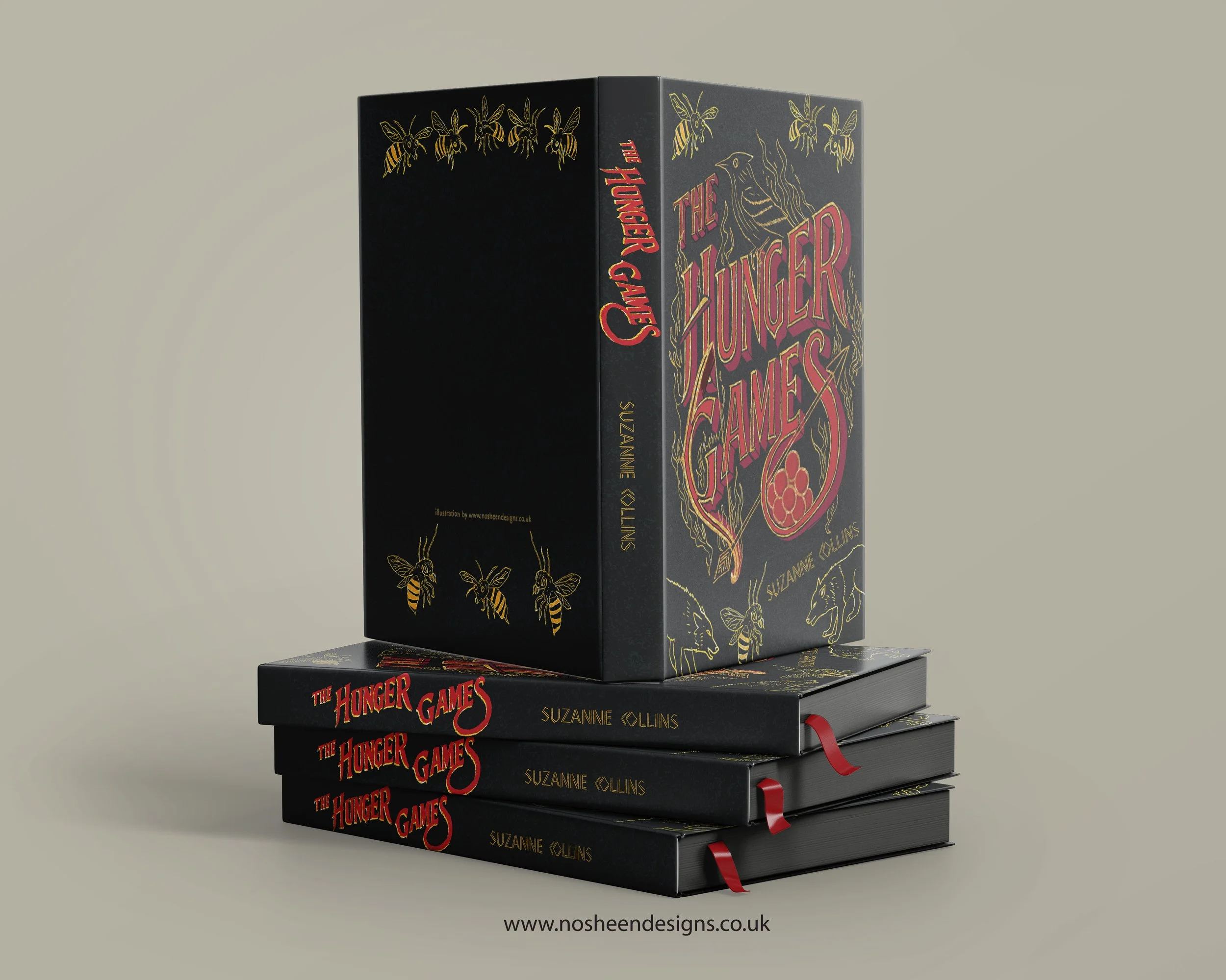
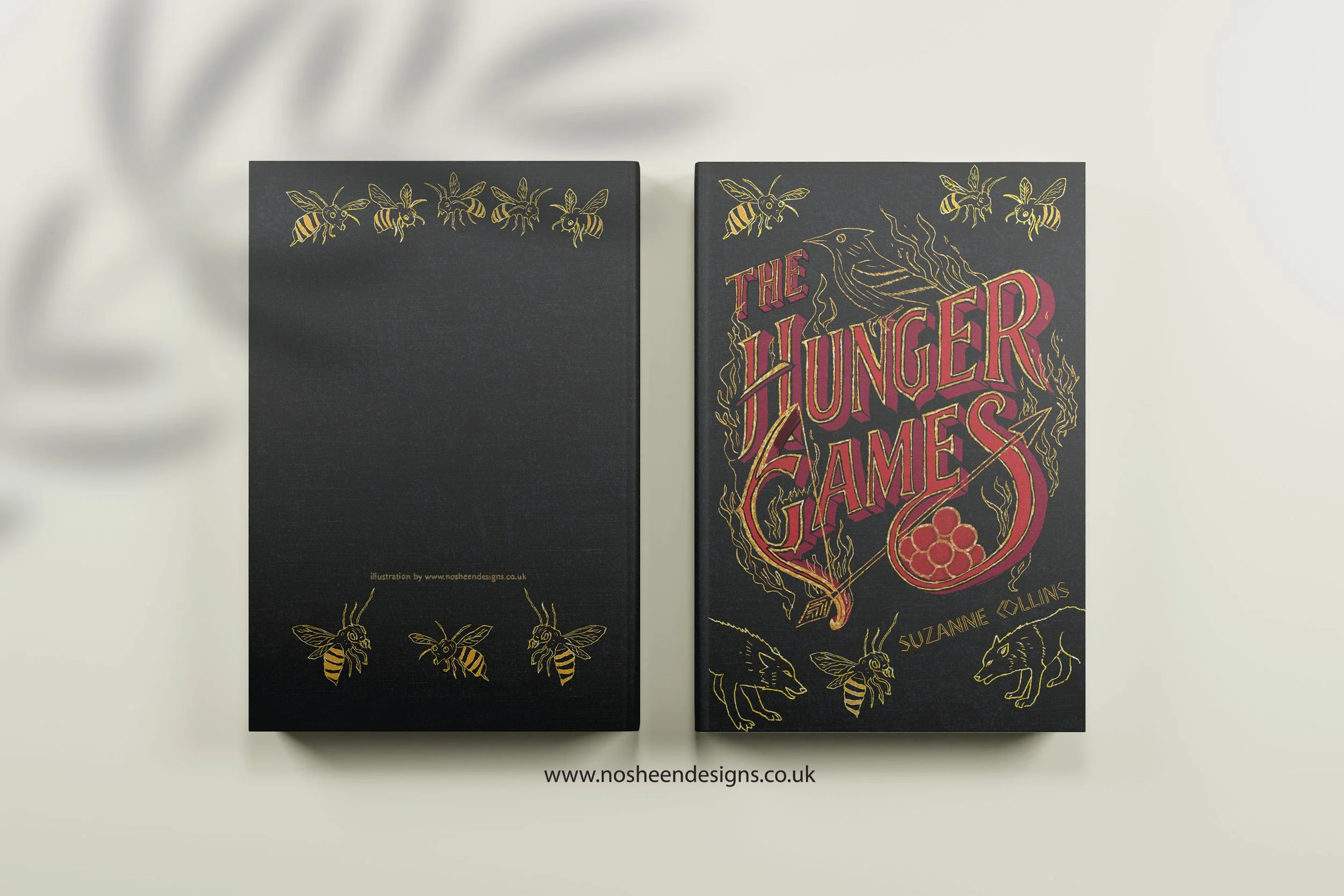
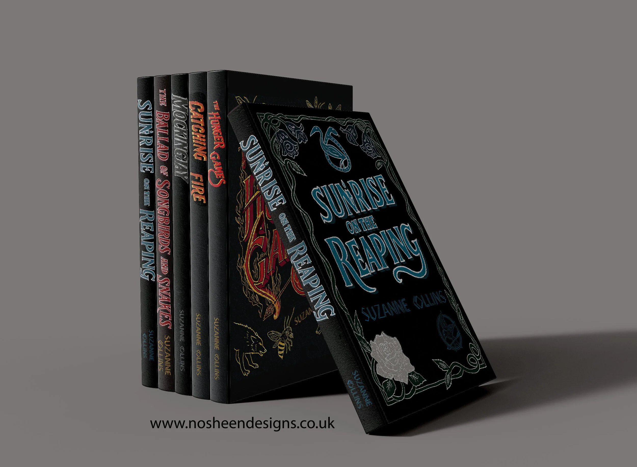
Book 1: The Hunger Games
Keywords: Hunger Games symbolism, mockingjay berries, rebellious lettering
To capture the brutality and beauty of the first book, I used a rich black background for District 12 — the coal mines and the ever-present shadow of survival.
Symbolic Elements
Borders: tightly drawn to represent the Capitol’s control and how the Games trap its tributes
Lettering on fire: a visual metaphor for rebellion igniting for the first time
Poisonous nightlock berries: threaded through the design to hint at defiance and sacrifice
Bow + arrow: a direct link to Katniss’ identity and growing agency
Everything is hand-drawn to keep the artwork raw, human, and rooted in emotion.
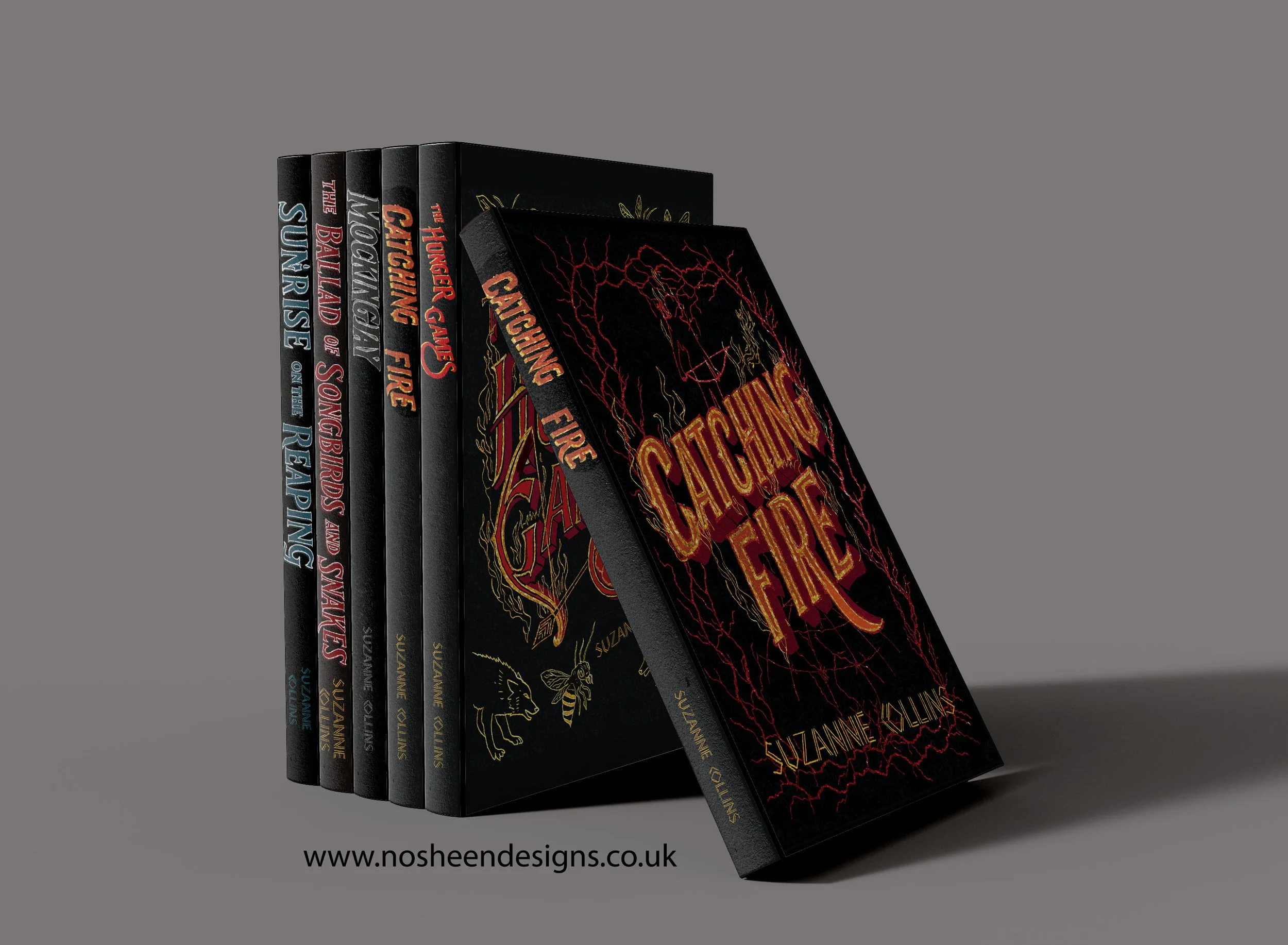
Book 2: Catching Fire
Keywords: book cover design catching fire, rebellion symbolism, force field illustration
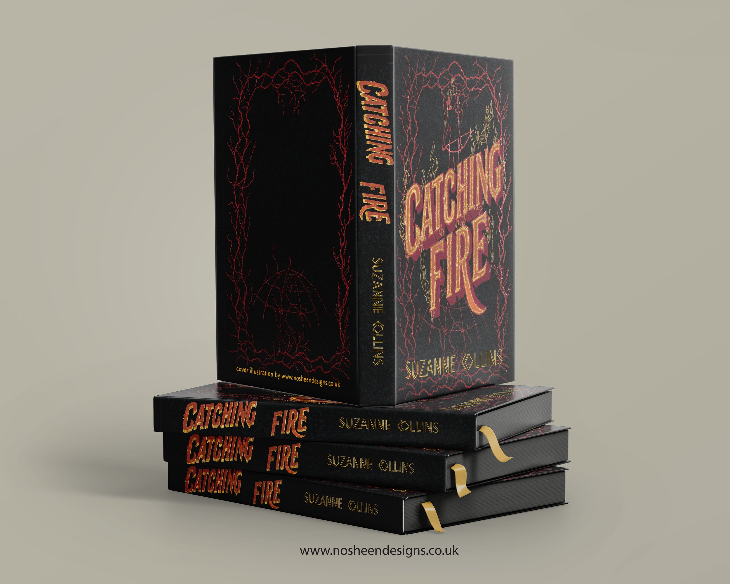
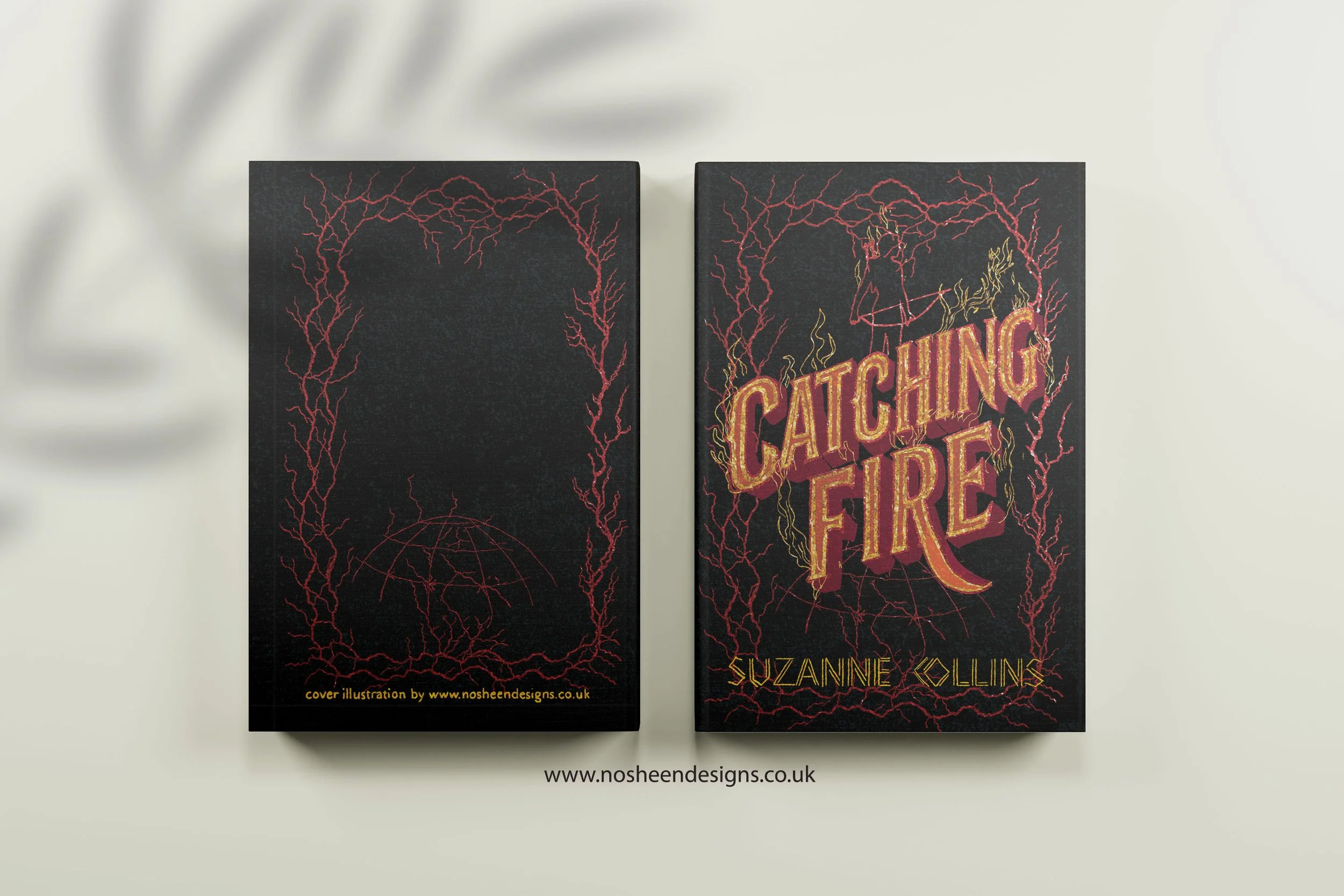
For Catching Fire, I wanted the illustration to feel explosive — like something breaking open from the inside.
What I focused on
Lettering breaking through a force field: symbolising Katniss’ discovery and the shattering of Capitol control
Flames woven into the title: showing rebellion spreading beyond the arena
Borders beginning to rupture: representing cracks in the system
This book is about escalation — fire as revolution — and the artwork reflects that energy.
Book 3: Mockingjay
Keywords: Mockingjay symbolism, dystopian illustration, District 13 design
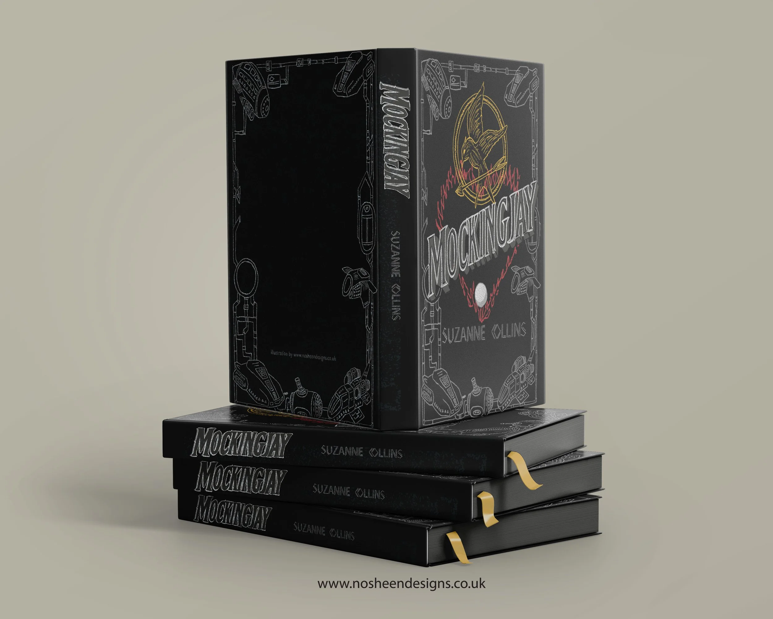
The final book is a collision of love, war, trauma, and hope. I wanted the design to be emotionally conflicted — just like Katniss.
Symbolism included
A burning heart: representing Katniss and Peeta’s love, enduring even in darkness
The pearl: a soft, delicate motif symbolising memory, comfort, and connection
Hovercrafts + pipes of District 13: showing the underground, industrial, hidden world
Dark colour palette: evoking loss, devastation, and the cost of rebellion
It’s a design about the weight of leadership — and the fragile hope that survives in the ruins.
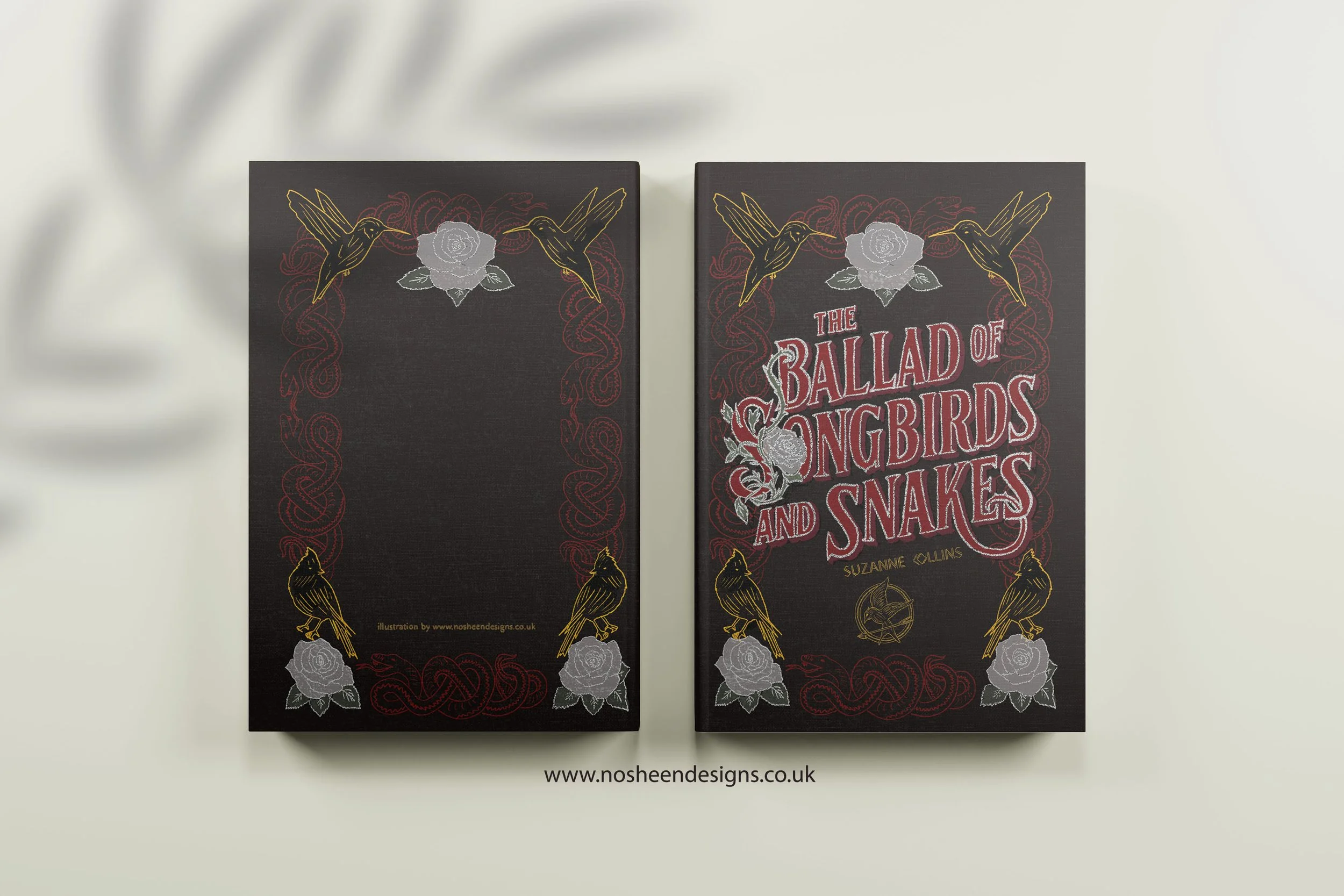
Book 4: The Ballad of Songbirds and Snakes
Keywords: Snow backstory, songbirds snakes symbolism, YA prequel illustration
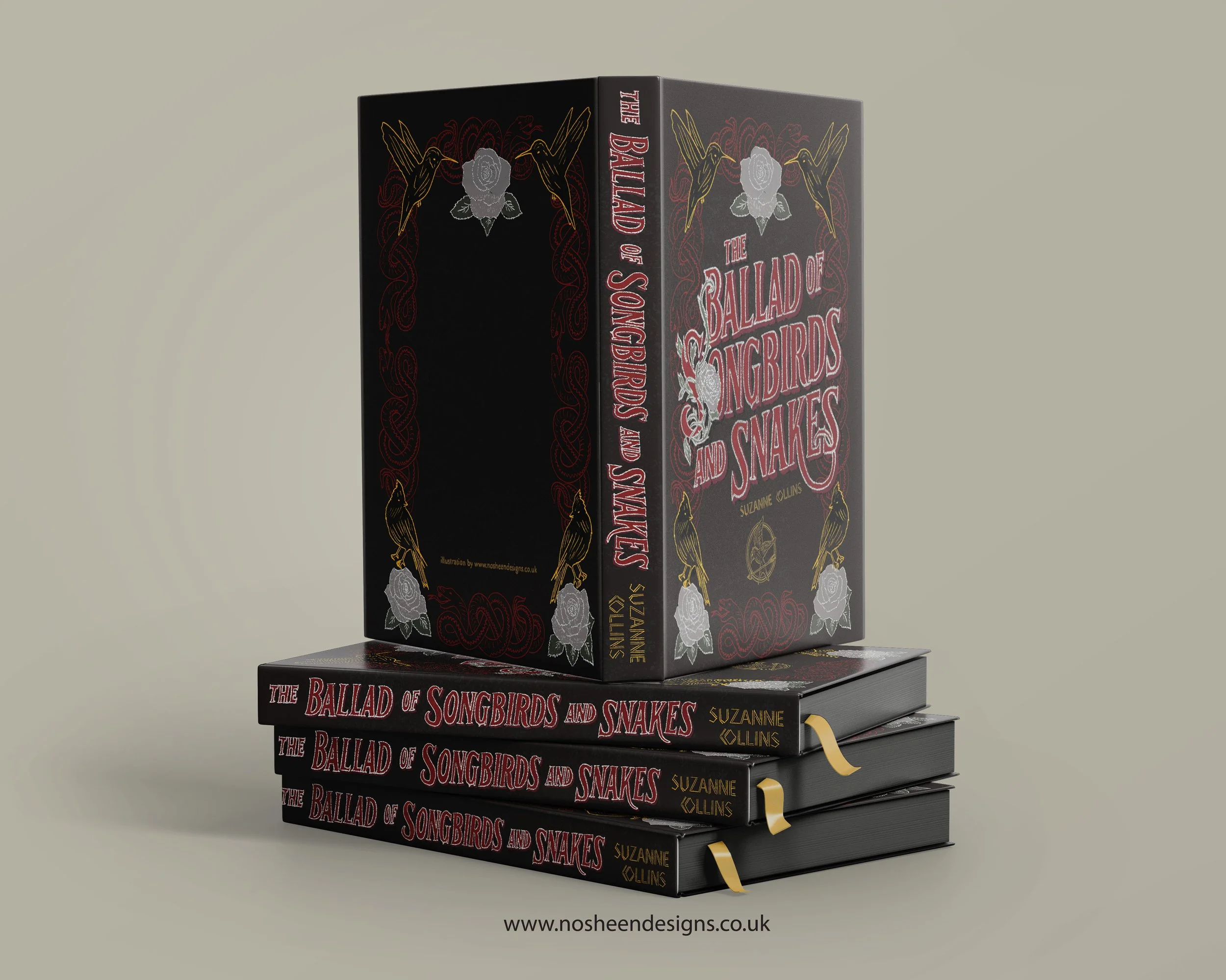
Snow’s story required a colder, more strategic visual language.
Design choices
Snakes + songbirds forming the border: representing manipulation, charm, danger, and innocence
A crown-like composition: hinting that Snow always lands on top
Subtle metallic touches: to suggest prestige masking cruelty
This cover needed to feel elegant yet unsettling — a warning more than a celebration.
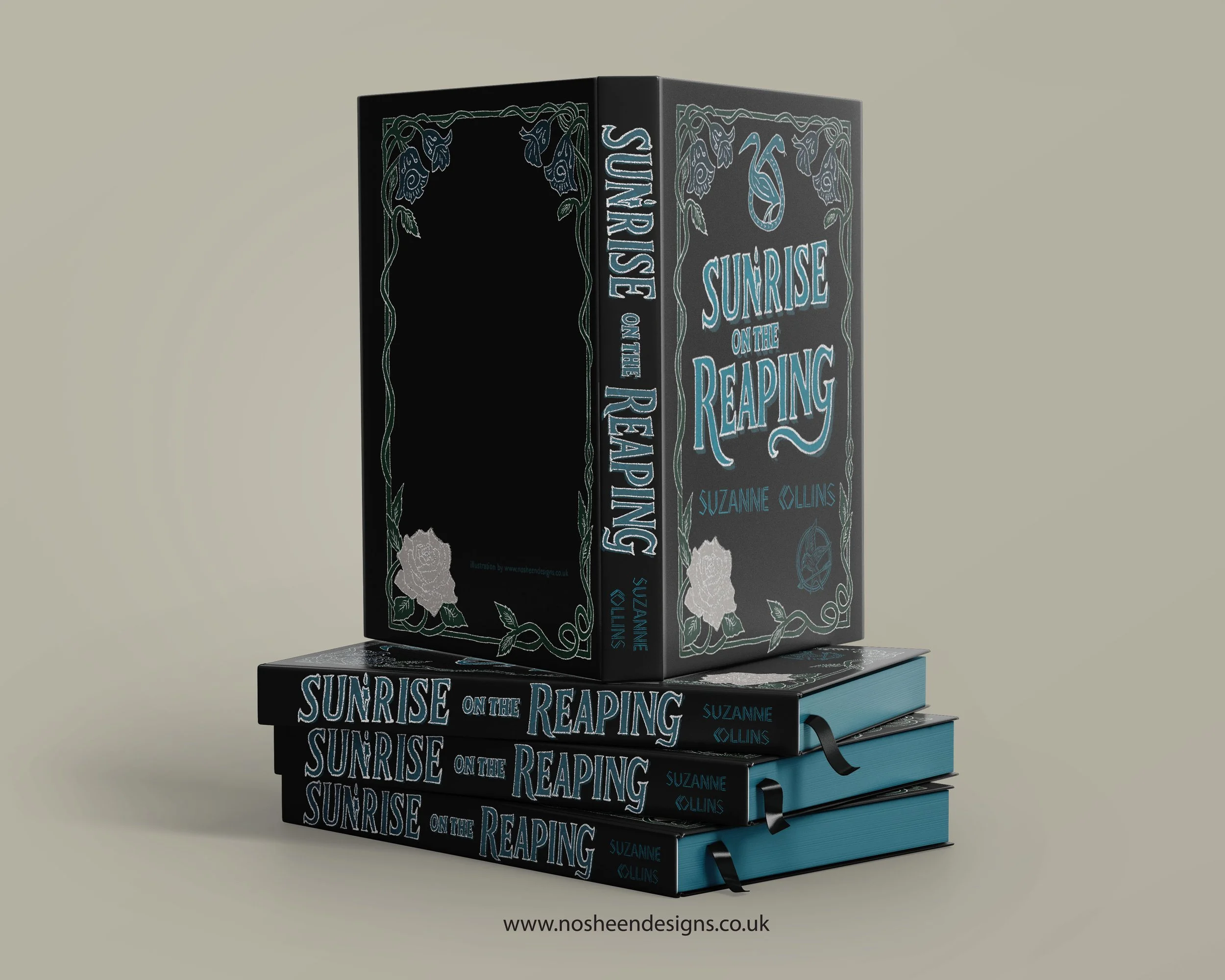
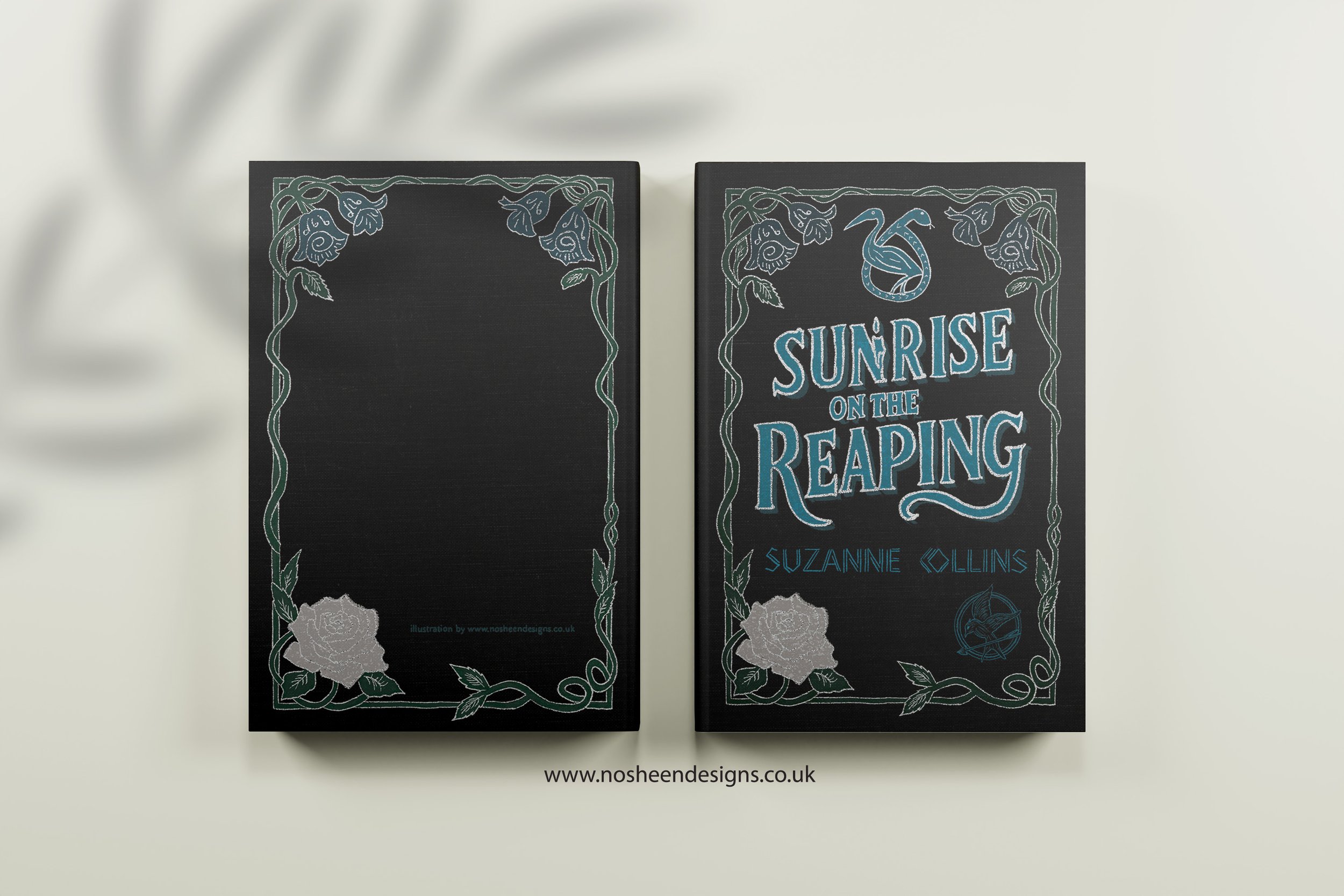
Book 5: Sunrise on the Reaping
Keywords: Haymitch Hunger Games art, prequel illustration, Hunger Games symbolism
For Sunrise on the Reaping, I leaned into themes of cruelty wrapped in spectacle.
Key symbols
A burning candle within the lettering: representing that on his birthday, Haymitch is thrown into the Games
White + glitter details: showing Snow’s power still shadowing Haymitch’s life
Bold, oppressive typography: symbolising a tribute’s lack of agency
This cover is about inevitability — fate sealed by a system designed to crush.
Conclusion: Why Symbolism Matters in Book Cover Illustration
Keywords: cover illustration process, meaning in illustration, symbolic book design
Every cover in this series is built from:
symbolism
emotional nuance
narrative meaning
hand-drawn texture
My goal was not just to recreate scenes — but to capture the soul of each book through symbolic storytelling.
If you're a publisher, editor, or art director looking for hand-drawn book cover illustration with emotional depth and strong visual storytelling, I’d love to connect.
Website: nosheendesigns.co.uk
Instagram: @nosheendesigns
Email: hello@nosheendesigns.co.uk


