Designing a Mosaic-Inspired Book Cover for SPQR — My Concept, Process & Visual Storytelling
When I set out to redesign the book cover for SPQR, I knew immediately that the artwork had to feel timeless, grounded, and unmistakably Roman. SPQR — Senatus Populusque Romanus — is more than an acronym; it is the visual and ideological backbone of Roman history.
For this portfolio project, I wanted to create a cover that felt as enduring as the civilisation itself, and a mosaic became the perfect metaphor.
Why Mosaic? The Concept Behind the Design
Roman mosaics were designed to last centuries.
They carried stories, myths, and symbols across time — footsteps worn into them, but their meaning still intact.
So I approached my SPQR cover with this question:
What artistic language can hold the weight of Roman history?
A mosaic made perfect sense.
It symbolises:
longevity
craftsmanship
discipline
cultural identity
the foundations of Roman civilisation
Just as SPQR forms the backbone of Roman political and civic life, mosaic floors formed the literal foundations beneath Roman homes, temples, and palaces.
Creating Mosaic Lettering: History Through Typography
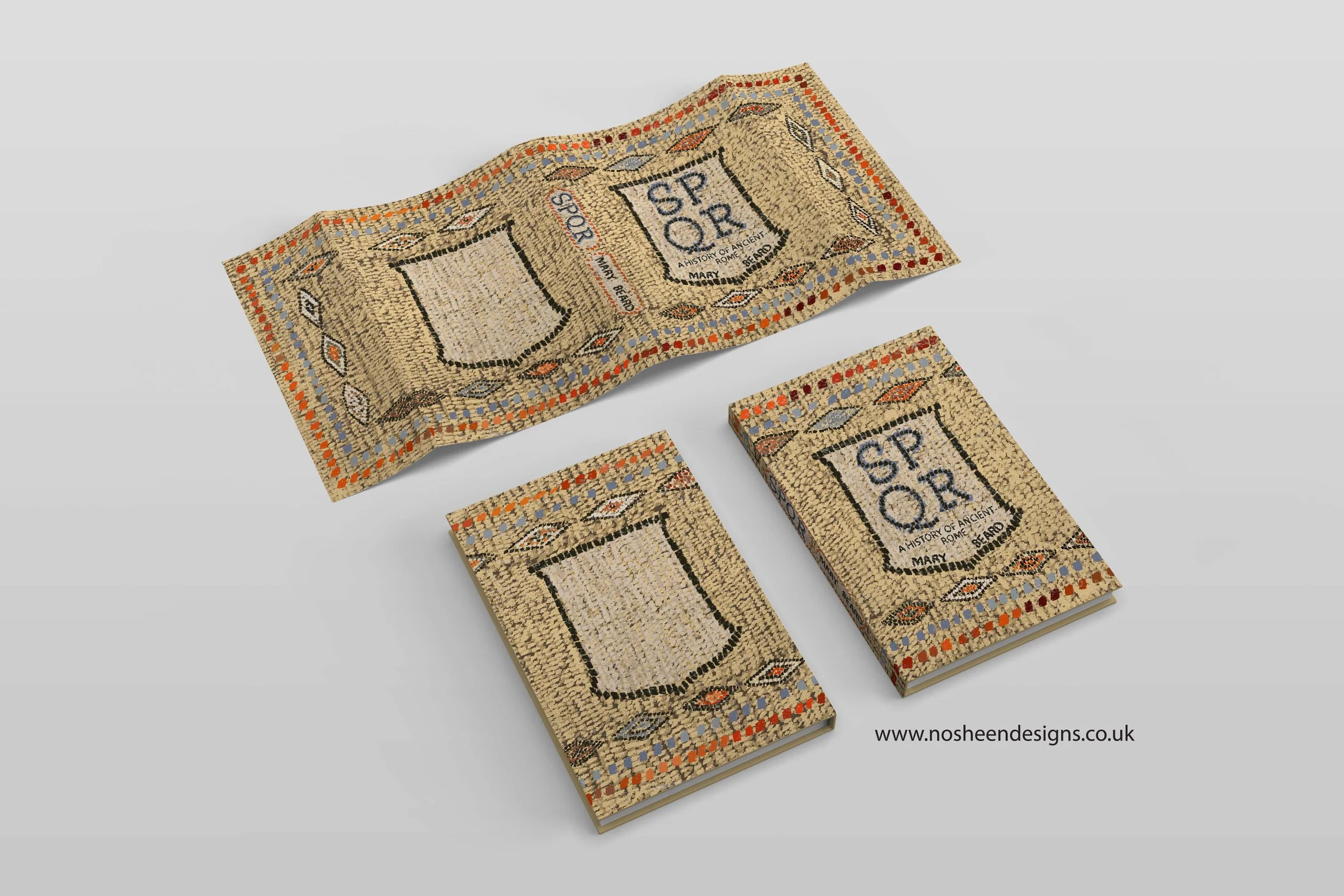
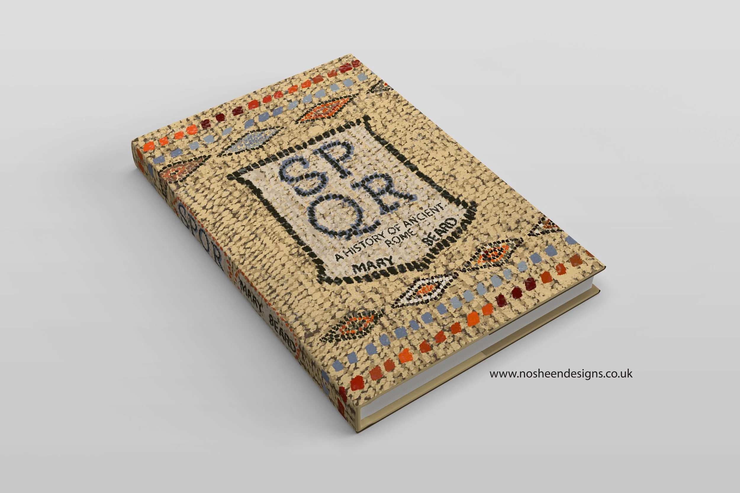
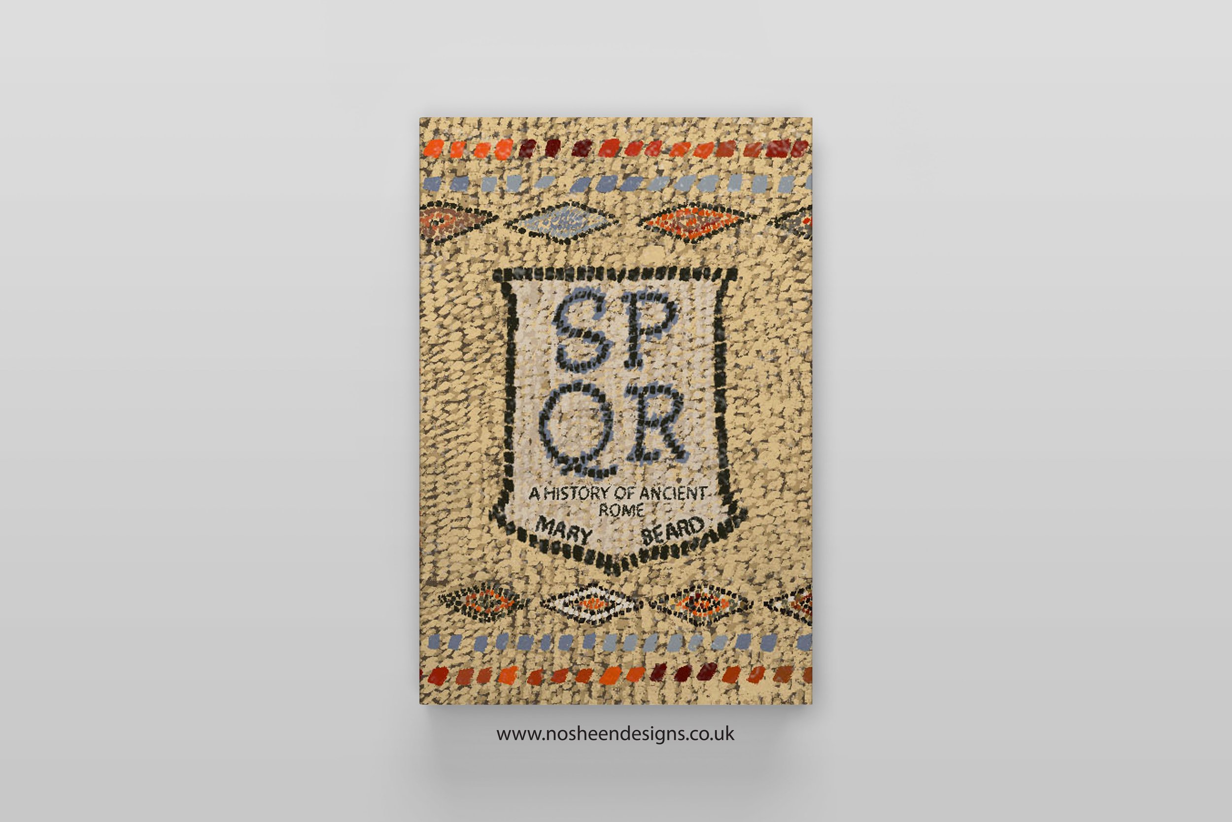
I hand-illustrated the title using a mosaic style — individual “tiles” forming each letter.
This lettering approach was more than decorative; it carried narrative meaning.
Mosaic lettering allowed me to express:
strength — each tile forming a solid whole
order — the precision and geometry of Roman engineering
tradition — ancient craft forming modern design
roots — SPQR as an unshakeable foundation of Roman identity
The letters are not simply placed on the design — they feel built into it, much like inscriptions carved into stone.
A Cover That Feels Like History Under Your Feet
Instead of depicting emperors, battles, or monuments, I chose to evoke the everyday artefact that almost every Roman encountered:
the mosaic floor.
I wanted the reader to feel as if the book itself was a historical fragment — something excavated, brushed off, and brought back into the modern world.
This design approach offers:
a tactile, grounded feeling
a strong visual identity
a subtle but powerful nod to heritage and legacy
a cover that appeals to history lovers without relying on clichés
Symbolism: SPQR as the Foundation of Rome
In Rome, mosaic floors didn’t just decorate — they reinforced status, culture, and power.
My design reflects that symbolism.
In this cover:
The mosaic represents Rome’s structure and durability
The lettering represents the civic identity of SPQR
The entire design acts as a metaphor for Roman foundations
Just as real mosaic tiles must interlock perfectly, Roman society depended on its systems, laws, and identity — held together through SPQR.
A Piece Designed for Readers of History
This cover was designed with historical nonfiction readers in mind — people who enjoy:
classical history
archaeology
ancient civilisations
academic texts with strong visual presence
The hand-drawn mosaic approach gives the book:
a scholarly tone
a museum-quality aesthetic
a tactile, authentic feel
contemporary readability
It’s a blend of ancient-inspired craftsmanship and modern design clarity.
Final Thoughts
Illustrating the SPQR cover allowed me to merge:
historical symbolism
hand-drawn craft
typography and illustration
my love for visual storytelling
It’s a project that honours the resilience of Roman culture, using the language of an art form that has survived thousands of years.
If you are a publisher or art director looking for hand-drawn, concept-led book cover illustration, I would love to connect.
Website: nosheendesigns.co.uk
Instagram: @nosheendesigns
Email: hello@nosheendesigns.co.uk


