

Sunrise on the Reaping Book Cover | The Hunger Games Illustrated Book Cover Series | Conceptual Hand-Drawn Design


Hand-drawn Hunger Games book cover series using arena borders and dark palettes to explore power, survival and the illusion of freedom
The Hunger Games Series — Illustrated Book Cover Designs (5-book series)
This illustrated book cover series for The Hunger Games explores the idea that survival does not equal freedom — and that even victory exists within invisible boundaries.
Series Concept
Across all five covers, I used the arena as a border, rather than a central image. This design choice was intentional: the arena is always present, even when it is no longer physically visible.
By framing each cover with the arena, I wanted to communicate that the characters — and especially Katniss — are never truly free, even after winning. Power, surveillance and control persist beyond the games themselves, enclosing the story at every stage.
The borders act like a visual cage: subtle, enclosing and inescapable.
Colour and Atmosphere
I used black as the dominant background colour across the series to give a direct nod to District 12 — its coal dust, poverty and harshness — and to reflect the moral darkness of the world the characters inhabit.
The restrained, dark palette creates a sense of heaviness and tension, allowing symbolic elements to carry emotional weight rather than relying on spectacle. This mirrors the books themselves, which are less about action than about power, trauma and consequence.
Hand-Drawn Approach
All illustrations and typography were hand drawn, reinforcing the human cost at the centre of the story. The imperfect lines and textures echo fragility, resistance and survival — qualities that define the characters far more than heroism.
Rather than illustrating specific scenes, I focused on symbolism and atmosphere, allowing readers to bring their own interpretation and emotional memory of the books into the covers.
Series Cohesion
Each cover works individually, but together they form a unified visual language:
The recurring arena border creates continuity
The restrained palette builds a consistent emotional tone
The hand-drawn quality grounds the dystopian world in something human and real
This approach reflects how the series itself unfolds — different stages of the same struggle, shaped by power structures that never fully disappear.
Intent
The goal of this series was not to glorify the games, but to quietly underline their cruelty. Even when characters survive, the system remains.
The covers invite readers to reflect on control, visibility and resistance — themes that sit beneath the surface of the story and continue long after the final page.
How I Illustrated the Hunger Games Series — Symbolism, Process & Creative Decisions
As a British Muslim, South Asian illustrator, storytelling has always been a way for me to process the world — visually, emotionally, symbolically. When I decided to illustrate The Hunger Games series for my portfolio, I wanted each cover to feel deeply connected to the themes of rebellion, survival, and human resilience that define Suzanne Collins’ world.
This blog post breaks down my full creative process — from colour symbolism to hand-drawn motifs — and shares the hidden details behind each illustration.
My Visual Approach to the Hunger Games Universe
I approached the series with one main question:
How can illustration capture the emotional weight and political commentary of Panem?
To answer that, I leaned into:
Hand-drawn elements to create intimacy and human vulnerability
Symbolic borders to represent confinement, control, and rebellion
High-contrast colours to mirror tension, destruction, and hope
Layered lettering to embed narrative clues into the titles themselves
Black backgrounds became the grounding motif — representing District 12, coal dust, and the oppressive darkness of the Capitol’s regime.
a
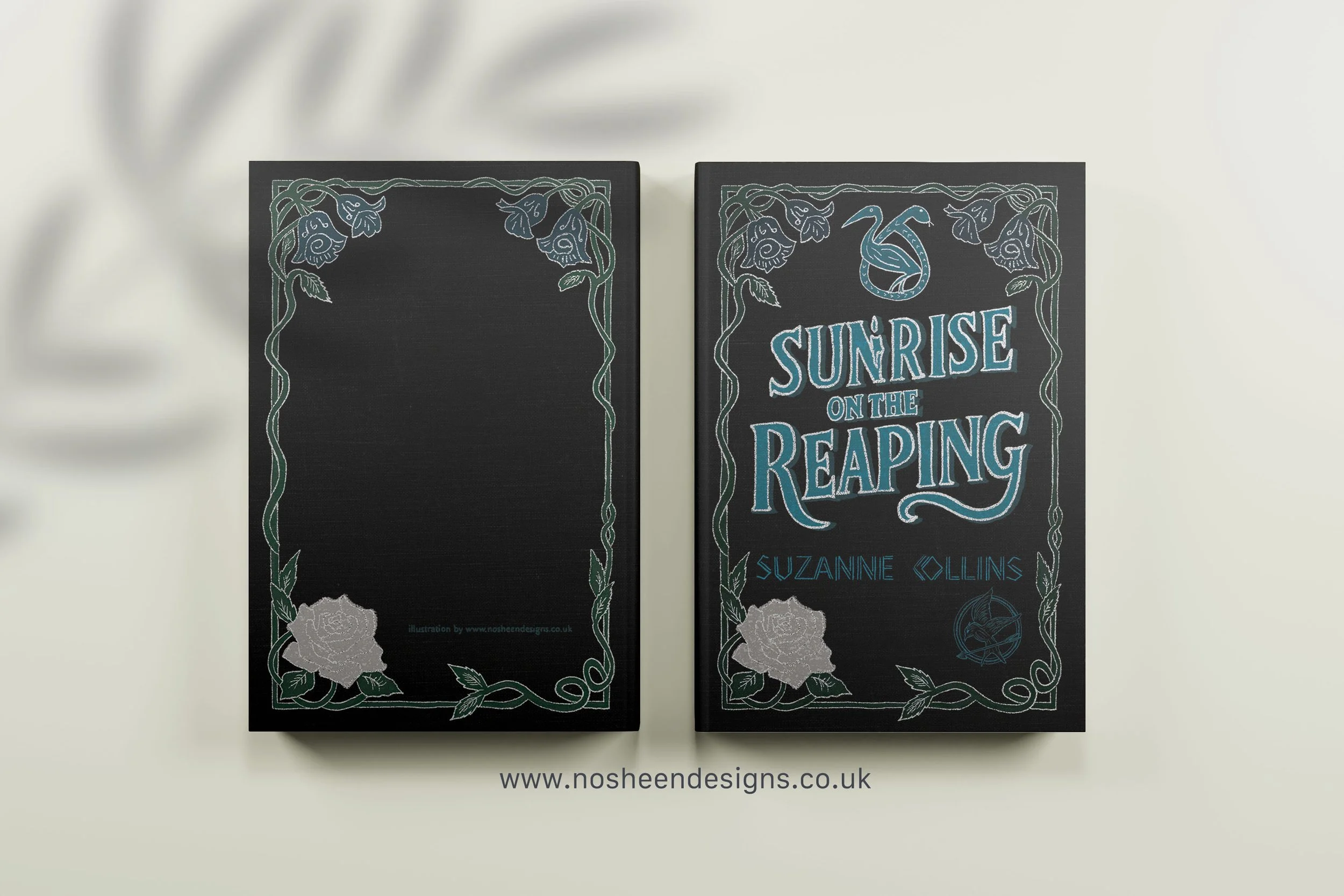
Book 5: Sunrise on the Reaping
For Sunrise on the Reaping, I leaned into themes of cruelty wrapped in spectacle.
Key symbols
A burning candle within the lettering: representing that on his birthday, Haymitch is thrown into the Games
White + glitter details: showing Snow’s power still shadowing Haymitch’s life
Bold, oppressive typography: symbolising a tribute’s lack of agency
This cover is about inevitability — fate sealed by a system designed to crush.
Conclusion: Why Symbolism Matters in Book Cover Illustration
Every cover in this series is built from:
symbolism
emotional nuance
narrative meaning
hand-drawn texture
My goal was not just to recreate scenes — but to capture the soul of each book through symbolic storytelling.
If you're a publisher, editor, or art director looking for hand-drawn book cover illustration with emotional depth and strong visual storytelling, I’d love to connect.
Website: nosheendesigns.co.uk
Instagram: @nosheendesigns
Email: hello@nosheendesigns.co.uk