

A Wrinkle in Time Book Cover Design | Hand-Drawn Illustration Concept

A hand-drawn illustrated book cover concept for A Wrinkle in Time by Madeleine L’Engle, exploring love, science, darkness and light through symbolic design.
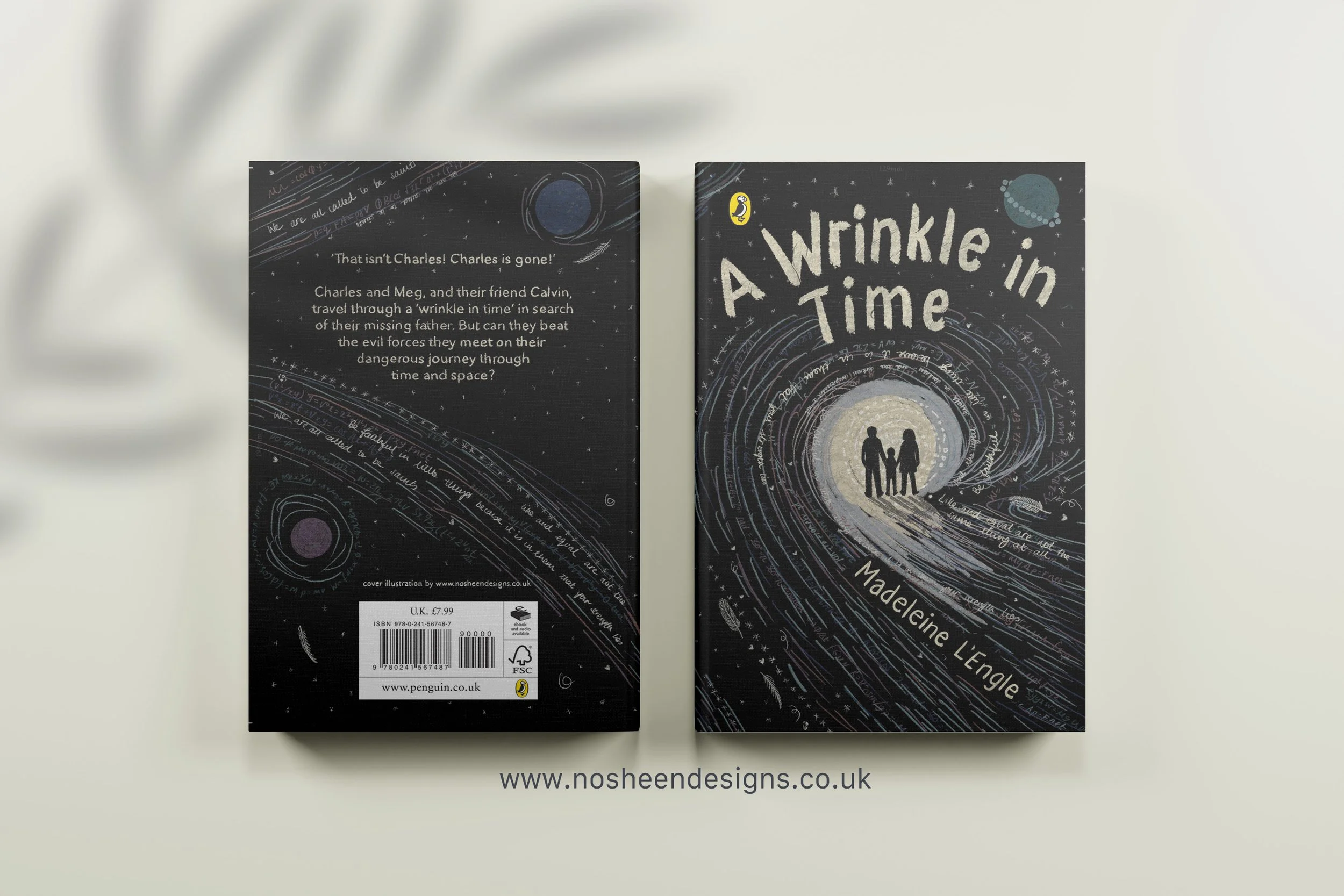
A Wrinkle in Time — Book Cover Design Concept
I created this illustrated book cover for A Wrinkle in Time by Madeleine L’Engle as a conceptual response to the novel’s core themes: love, science, darkness and hope. Rather than depicting a literal scene, I wanted the cover to communicate the emotional and philosophical heart of the story — that love is the most powerful force in the universe.
Concept and Narrative Thinking
At the centre of the cover is Meg, positioned within a burst of light. This light represents love — not as something sentimental, but as an active, guiding force that enables her to reach her brother and confront darkness. Calvin’s presence is suggested through movement and direction, reinforcing the idea that connection and companionship help guide Meg toward the light.
Surrounding this central glow is darkness, symbolising the oppressive force of IT and the emotional isolation that defines much of the story. The contrast between light and dark mirrors Meg’s internal struggle and the broader battle between conformity and individuality.
Science, Physics and the Cosmos
Science is fundamental to A Wrinkle in Time, and I wanted the cover to honour that. I incorporated real physics equationsrelating to gravity, kinetics and motion into the design, subtly embedded within the composition. These references nod to Meg’s parents, their scientific work, and the novel’s grounding in intellectual curiosity.
The cosmic imagery — galaxies, stars and celestial movement — reflects the story’s interdimensional travel while reinforcing the idea that the universe is vast, mysterious and interconnected.
Symbolism and Hidden Detail
Morse code is woven into the illustration, spelling out a message about love being intertwined with light. This hidden layer reflects the way love operates quietly but powerfully throughout the book — unseen, yet essential.
The three Mrs are referenced through abstract symbols: feathers, speech marks and star motifs. These elements are intentionally subtle, allowing discovery over time and rewarding attentive viewers in the same way the book rewards thoughtful readers.
The hostile planet is depicted as a controlled, ringed form, suggesting order without compassion — a visual metaphor for enforced perfection and emotional suppression.
Hand-Drawn Process and Typography
All elements of the cover — including the title, patterns and lettering — were hand drawn. I chose this approach to reinforce the book’s emphasis on humanity, imperfection and emotional truth. In a story that critiques cold perfection, the visible hand of the artist becomes part of the narrative.
The hand-drawn quality allows the reader to feel the warmth, vulnerability and love that ultimately drive the story forward.
Final Reflection
This cover is a visual interpretation of A Wrinkle in Time as a story where science and love coexist — where equations and emotion are not opposites, but partners. My intention was to create a cover that feels cosmic yet intimate, intellectual yet deeply human.