

Noughts & Crosses Illustrated Book Cover 3 | Conceptual YA Design
Noughts & Crosses — Illustrated Book Cover Design
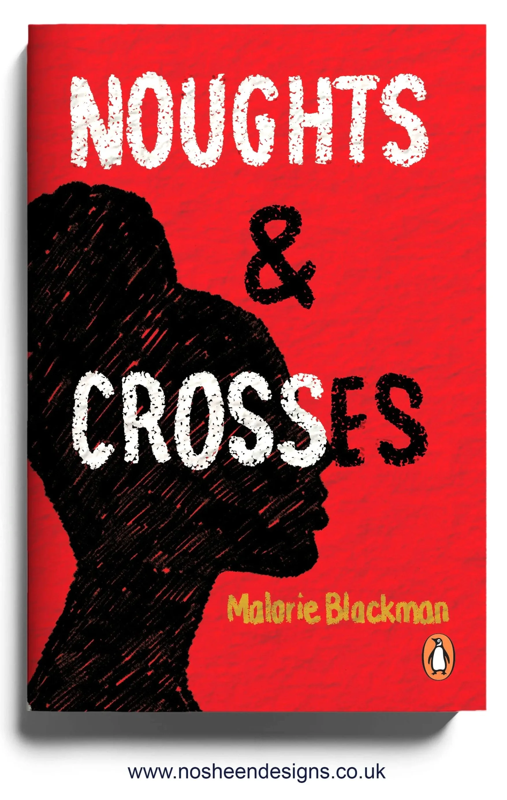
This illustrated book cover for Noughts & Crosses explores love, power and systemic injustice through a deliberately restrained and symbolic visual language.
Concept and Symbolism
I used a limited palette of black, white and red to directly reflect the book’s core themes:
Black and white reference the racial divide at the heart of the story and the rigid structures that keep society separated.
Red is used sparingly to symbolise love, violence and sacrifice — the emotional cost of crossing boundaries that are designed to stay intact.
Rather than illustrating a literal scene, I focused on distilling the emotional tension between Callum and Sephy into visual contrasts. The composition holds these opposing forces in balance, reflecting how love exists within — and is constantly threatened by — an unequal system.
Hand-Drawn Approach
All elements were hand drawn, including the typography, to keep the work grounded in human emotion rather than polish or spectacle. The imperfect line quality reflects vulnerability and fragility — particularly the way innocence is eroded by inherited power structures and prejudice.
This hand-drawn approach allows the cover to feel intimate and personal, mirroring the young voices at the heart of the novel.
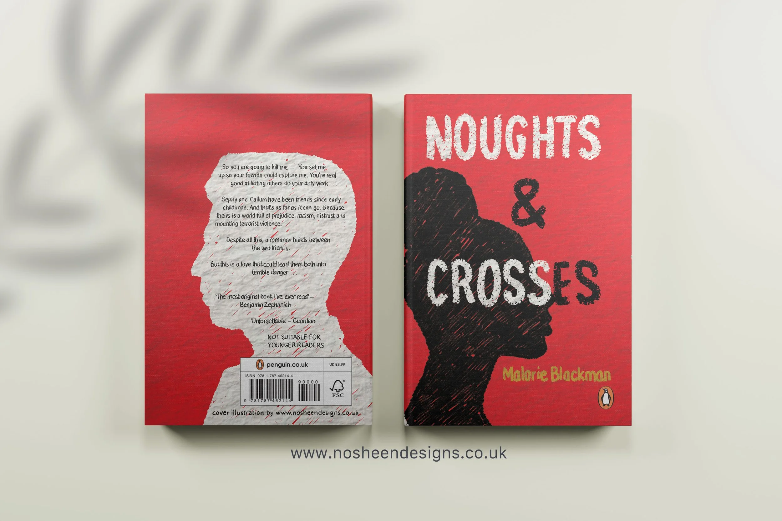
Endpapers
I also designed illustrated endpapers to extend the narrative beyond the front cover. The endpapers echo the same colour language and symbolic tension, reinforcing the themes of division and connection as the reader physically enters and exits the book.
The endpapers act as a quiet continuation of the story — a reminder that the issues raised do not end when the final page is turned.
Colour and Tone
The stark contrast of the palette creates a sense of inevitability and pressure, reflecting how deeply embedded the social hierarchy is within the world of the book. The limited use of red draws the eye and adds emotional intensity without overwhelming the design.
Intent
This cover was designed to speak to both young adult readers and adult crossover audiences, communicating that Noughts & Crosses is not only a love story, but a powerful examination of race, power and choice.
The aim was to create a cover that feels emotionally charged, thoughtful and timeless — one that invites the reader to confront difficult questions before opening the book.