

Animal Farm Book Cover Design | Conceptual Political Illustration


Experimenting with different colour waves
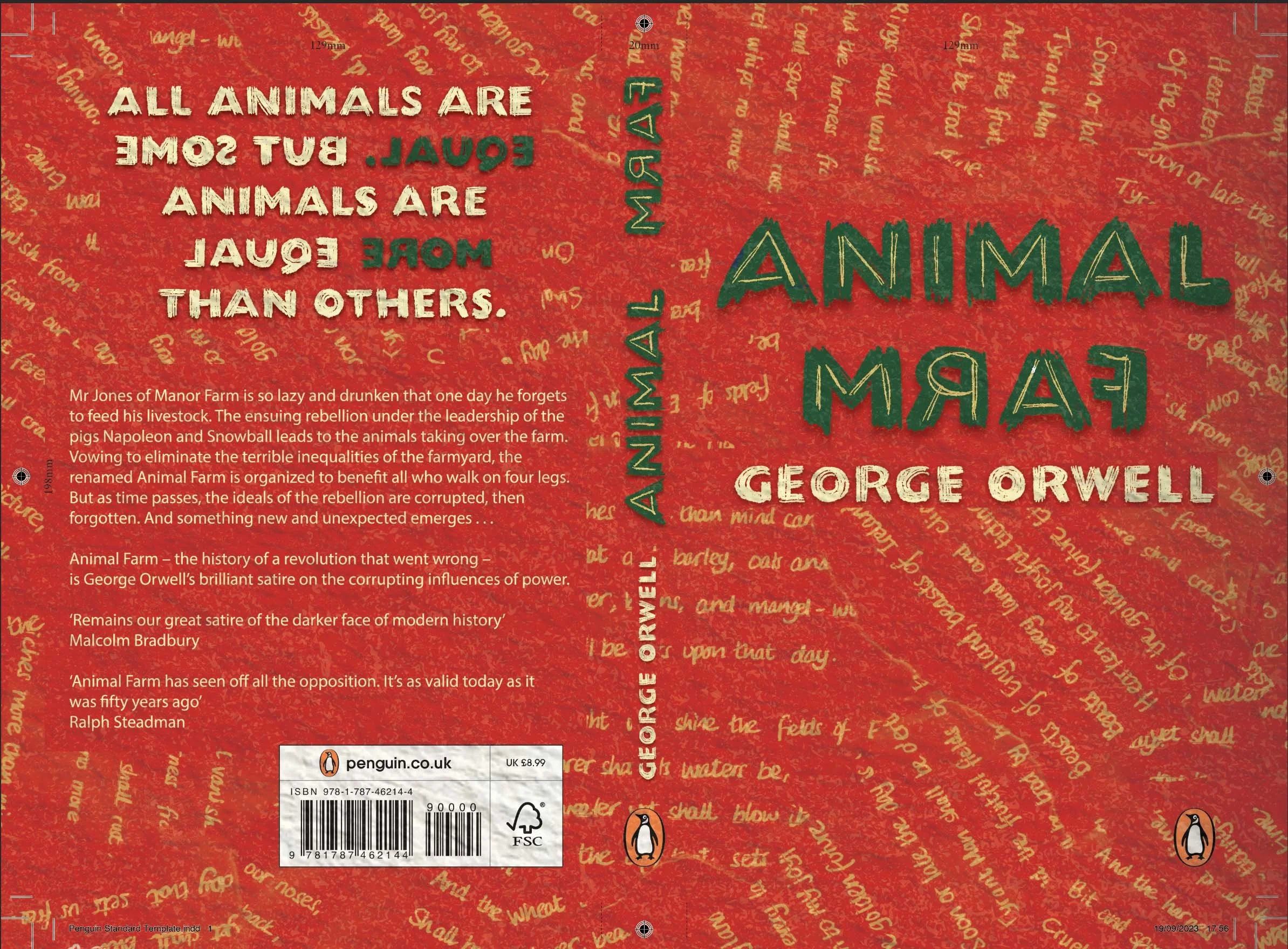

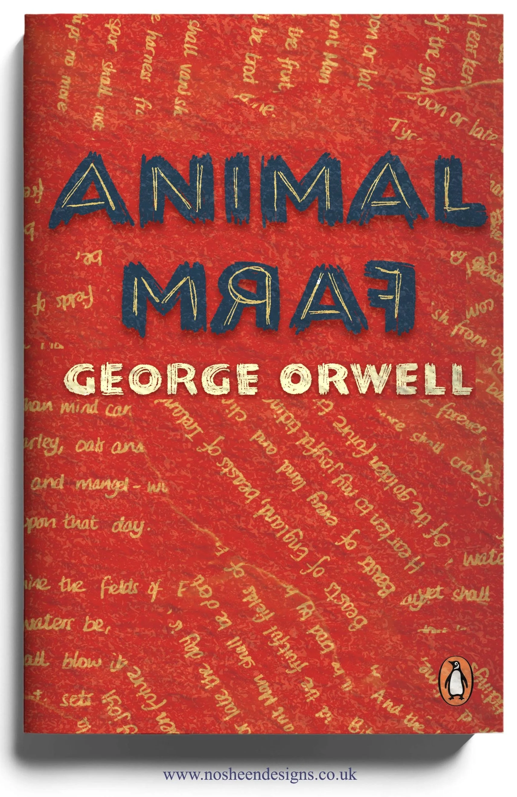
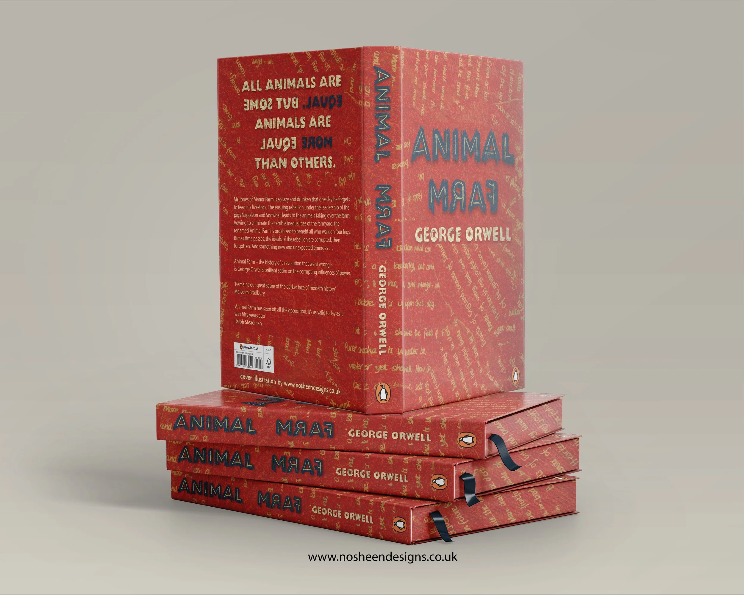
Animal Farm — Book Cover Design Concept
This illustrated book cover for Animal Farm explores how revolutionary ideals can be corrupted, distorted and ultimately turned against the very people they were meant to liberate.
Rather than illustrating individual characters, the design focuses on disorientation, irony and loss of meaning — central themes in George Orwell’s political fable.
Inverted Language and Visual Chaos
The title is hand drawn back to front, immediately unsettling the reader. This inversion reflects the chaos and moral reversal created by the pigs once they seize power. What was once clear becomes confused; what was once truthful becomes manipulated.
The reversed lettering acts as a visual metaphor for a society where language no longer means what it once did — a core idea in Orwell’s critique of authoritarian regimes.
Beasts of England: Unity Torn Apart
The revolutionary song Beasts of England appears in the background as ripped fragments, used as a repeating pattern. Originally written to unite the animals under shared hope and equality, the song’s destruction reflects the betrayal of those ideals.
By tearing the text and embedding it into the background, the cover shows how the very words that once inspired freedom are reduced to propaganda, emptied of meaning and repurposed by those in power. The irony of this transformation is central to the design.
Colour and Political Reference
The palette of red, blue and cream draws directly from the visual language of Stalinist propaganda posters. These colours are not used nostalgically or decoratively, but deliberately — to signal the rise of authoritarianism and the animals’ gradual descent into fascism.
The bold, limited colour scheme mirrors the simplicity and force of propaganda imagery, reinforcing how complex truths are flattened into slogans under totalitarian rule.
Hand-Drawn Process and Intent
All elements of the cover are hand drawn, allowing for imperfection, texture and human presence. This contrasts with the rigidity of propaganda, highlighting the tension between lived experience and imposed ideology.
The overall design aims to visually express Orwell’s warning: when power is unchecked, language is weaponised, history rewritten, and equality inverted.